
Evaluate the Effectiveness of Scientific Map (Scholarly Network) Visualizations
Introduction
Overview
In order to be comparable, both visualization tools selected (Skov, 2021; Purnomo, 2020) are scientific maps. Science mapping aims to reveal the structure and dynamics of academic research by providing a holistic view of the knowledge domain, i.e., the distribution and connections of academic units, such as topics, publications, journals, and researchers.
Comparison Framework and Criteria
It is necessary to evaluate items in the same aspects to conduct a valid comparative analysis. This paper focuses on analyzing “How” (visualization idiom and encoding) the visualizations achieve the goals, holding the “What” (data abstraction) and “Why” (visualization goal) aspects similar (Munzner, 2014). That is, how are these two scientific maps constructed in order to demonstrate the structure of academic research in certain knowledge domains? Specifically, the critique on “How” is based on three criteria:
- Effectiveness: convey the main idea effectively
- Clarity: be clear, straightforward, and focused
- Design: aesthetic expression
Good Visualization
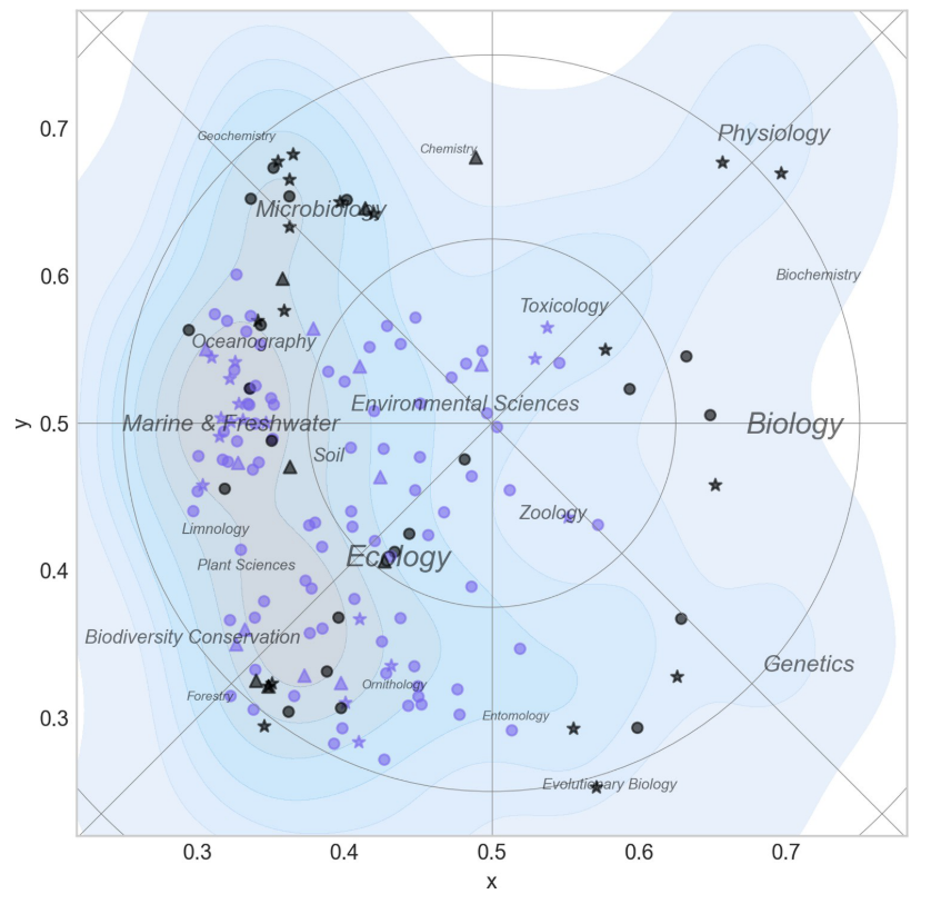
Visualization description
- Goal: To map the scientific landscape of research topics in biology and ecology fields, as well as the distribution of researchers working on these topics.
- Data: Researchers visualized are the permanent staff of BIOL and ECOS department in Aarhus University, extracted by the author in June 2020; their papers and corresponding keywords are collected from Web of Science; research topics are extracted from Web of Science subject categories.
- Construction: This visualization is built by the author using python. They first build a co-occurrence matrix of extracted keywords, map them into the 2D map using force directed placement (FDP), and finally posits papers at the center of their keywords’ coordinates and researchers at the center of their papers.
- Variables: In the “geographical” scientific map, place names are research topics, on which are the nodes whose color represents the fields (green = BIOL, blue = ECOS) and the marker indicates the category of each researcher (stars = professors, circles = senior staff; triangles = junior staff).
Analysis
The visualization clearly shows the distribution of research themes and researchers in BIOL and ECOS departments.
- Effectiveness: The visualization successfully achieves its goal, depicting the distribution in an informative, expressive way. The general patterns are noticeable: BIOL researchers are scattered throughout the map, covering more research specialties, while those from ECOS are closer to each other, confined to the ecology realm. The audience obtains an intuitive understanding of which research specialties the researchers cover and where their research interests overlap.
- Clarity: It mimics geographical maps, making the distribution clear and highly intuitive. The discrete objects (researchers) demonstrate noticeable patterns of clustering, and the continuous fields facilitate this expression by drawing high-density fields more colorful. Also, this figure contains additional information, the researcher categories (professors, senior, and junior staff), but does not distract the viewers’ attention and derivate the main objective. The author achieves this by using marks and keeping the node sizes constant.
- Design: The colors in this image are all cool tones, including black, gray, blue, and purple, adding a sense of harmony and unity. In the continuous fields, the lowly saturated, highly transparent colors smoothly transit from gray to light blue.
Poor Visualization
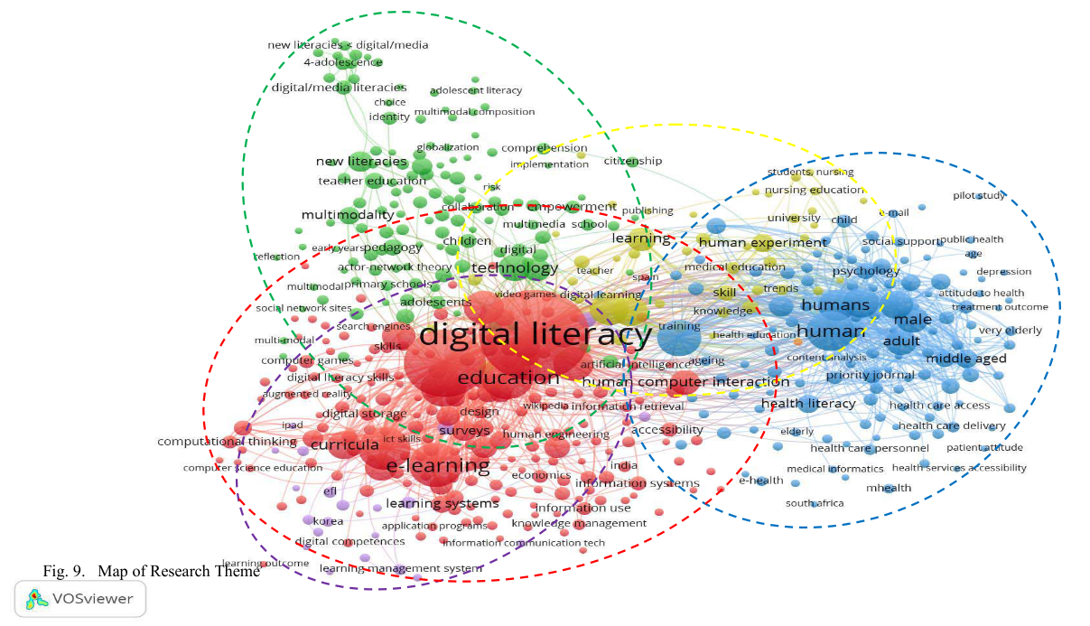
Visualization description
- Goal: To highlight the research themes in digital literacy, based on the distribution of research keywords.
- Data: 2,749 academic documents that contain keywords related to digital literacy, published from 1997 to 2019, are obtained from Scopus database. Among a total of 6,896 documents’ keywords, there are 534 keywords are visualized since they occur at least five times in the corpus.
- Construction: The authors build this network with VOSviewer and then use its built-in clustering algorithms to identify five research themes (learning, information communication, technology, human, and education). These clusters are named based on their dominant keywords. For example, the learning cluster is dominated by keywords including training, skill, knowledge, publishing, and human experience.
- Mark & Channel: use circle marks to represent the themes, with
- Variables: Colors of the nodes represent the categories they belong to (yellow = learning, purple = information communication, green = technology, blue = human, red = education); node size and label size indicate the frequencies of keywords.
Analysis
- Effectiveness: The visualization wants to highlight keyword clusters, but without proper explanation and labels, the audience gets confused about the differentiation and definition of the clusters found by the authors.
- Clarity: The clarity of this map is poor. First of all, unnecessary information and duplicated marks distract the viewers’ attention. Given its focus on node distribution, the links between nodes, stressing their relationships, are not necessary to explicitly visualize. Similarly, marks of node size and label size are duplicated since both of them represent the frequency of keyword occurrence. Meanwhile, the improper use of colors distorts the message to be conveyed. Each cluster should be equally presented since the authors give no ranking or emphasis on certain clusters. However, because of the lack of consideration in color encoding, some clusters (yellow and purple clusters) are almost unnoticeable compared to other clusters.
- Design: The node colors are too saturated to be like “shouting” at the audience. Moreover, though it is a 2D map, the nodes show 3D textures, looking more like “balls” than “circles”, which makes the figure overcomplicated and messy.
Conclusion and Discussion
While both visualizations are intended to show the distribution of researchers and research topics in certain academic fields, the key difference is whether their design choices directly and strongly support the ideas they are trying to convey. In other words, the “how” must clearly support the “why”. These three criteria are not independent of each other—clarity serves effectiveness, and the aesthetic value of design should not distract from the effective communication of ideas. Therefore, the primary criterion is effectiveness. This is the general principles, and below are the specific takeaways:
- The key is to understand the purpose of the study and answer them directly, getting rid of any irrelevant information. Designers need to be aware that visualization, rather than purely displays, is argumentative. If it is used to communicate some point, make the message clear; if it is not relevant to the argument, do not include it at all in the scientific article and put in design books instead.
- Aesthetics matters, and it serves the information communication. A common mistake is to include whatever looks great, and muddy-yet-fancy data visualizations run the risk of being conceived as show-offs. The implication is that effective visualizations conform to principles such as straightforwardness and interpretability. Some visualizations may find their place in modern art exhibitions, where artworks can be well explained anyway, but are less welcome in scientific journals.
Thus, the bad example can be improved if the authors:
- Effectiveness: use bold text to explicitly label the five clusters;
- Clarity: exclude links and select only the dominant keywords to display;
- Design: desaturate the colors and increase their opacity.
A good visualization does not need to get an A+ in every aspect, but effectiveness is the priority.
References
Purnomo, A., et al. (2020). Digital Literacy Research: A Scientometric Mapping over the Past 22 Years, IEEE. DOI: 10.1109/icimtech50083.2020.9211267.
Munzner, T. (2014). Visualization Analysis and Design (1st ed.). A K Peters/CRC Press. https://doi.org/10.1201/b17511
Skov, F. (2021). “Science maps for exploration, navigation, and reflection—A graphic approach to strategic thinking.” PLOS ONE 16(12): e0262081.